Erik Johansson
I had always liked the idea of taking a normal landscape and adding something fantastical to it, the work of Erik Johansson has always been really inspiring in this way. I’ve been a fan of his for quite some time and have already made a few attempts at trying to emulate his style in my own way.

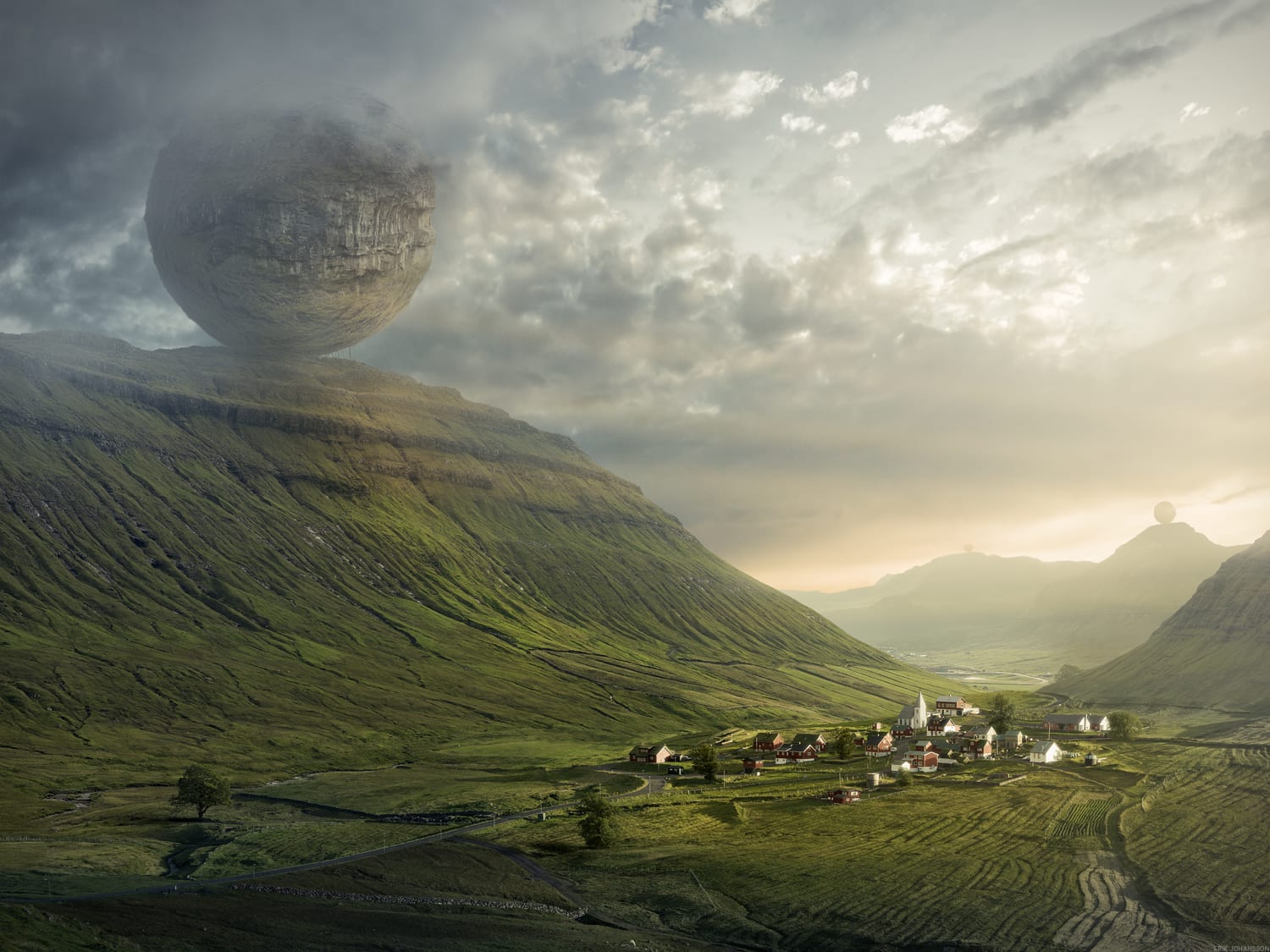
So I really liked the idea of grabbing images of normal looking landscapes and adding something fantastical to them in a similar fashion to Erik, this would also involve some retouching which I’ve always wanted to try. Erik takes the idea of having things that would normally look very out of place, and blends them seamlessly into the environment. His video’s detailing how he creates these images have taught me a lot about how he goes about making these images, from creating the initial concepts, to gathering all the individual assets and stitching them together into one coherent image. It’s this process that I’ve decided to try and emulate in my own work, however I won’t be creating all the assets myself, instead I’ll be getting the major components myself and gathering images I feel fit the scene to build up an image.

Erik Almas
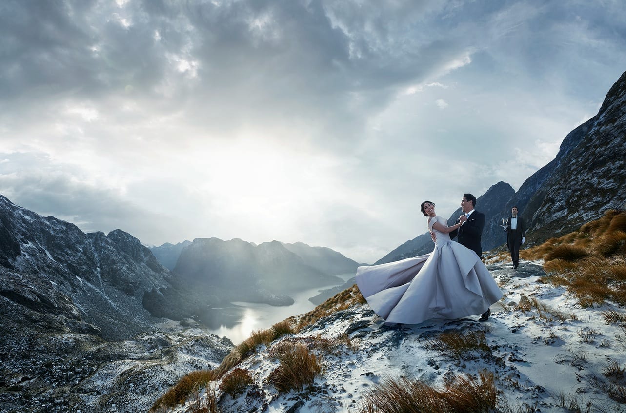
Erik Almas has a very similar style to Erik Johansson, they’re both photography retouchers and focus on creating fantastical imagery and landscapes. However While Johansson focusing more on capturing a single moment, Almas has a lot of movement in that majority of his images. He creates this is various ways such as motion blur, things that are moving towards a destination and by using objects that you’d usually associate with movement, such as a wedding dress while the wearer is spinning around. This use of movement in an image would be the main aspect that I hope to take away from his photography. I feel like his work has a more commercial feeling than Johansson’s, this is something I want to stay away from in my own work. However this makes sense as the majority of Almas’s work is for advertisements, whereas Johansson creates a lot of his work with the intension of it being sold as prints, however he does also have an extensive background in advertisement as well, but the work aimed at selling a product won’t be my focus on this brief.
Development
So I started out with an image I took straight out of my bedroom window to see what I thought I could add that fit in with the environment.

After some editing to bring out the darker spots and bring the sky back in, I started trying to think about what this landscape made me think of. The first thing that came to mind was building something, since it looks all industrial. I had just finished watching Pacific Rim, so I thought that adding some giant robots might be able to be blended into the landscape fairly seamlessly.

So I grabbed the first clean cut image of a Jaeger I could find and threw it in there. It’s colour scheme matched that of the buildings around it quite well after some tweaking.

Then added some colour correction to help it blend and give it some more contrast instead of just the solid black.

And then placed it behind one of the buildings. I also added some atmosphere in front of it to help it look like it was a far ways off into the distance.
I really liked the final result of this image, I think that it fits in well with the landscape and gives the original image a new meaning in terms of what kind of environment you’re looking at.
I did the same thing for my second image, however with a different environment so I adapted my vision to fit the new area.

I started off with an image I took out of a train window of the sun peaking through some clouds in the middle of a transport hub. I felt that this environment was more urban/rural than the pure industrial of my previous. I feel like I leans towards rural more, and I see it as urban because I know myself that it is in fact an urban area, whereas the picture might not convey that.
 I played around with a couple of different robot designs I found and settled for this one, as I thought that it looked like it had (as much as a 100ft robot can) a calm expression and was somewhat peaceful, helping it blend into the environment a little better. Also the colour of the robot itself matched the temperature of the image which was a big bonus.
 After some colour correction and blending I was finished with the image, I think that it blends well into it’s surroundings. The image is very segmented into foreground, midground and background, with the poles, robot and sky, all of which are very predominant in this image.