Mark Seliger
Mark Seliger is a photographer, specialising in studio portraiture. He has photographed many famous actors such as Brad Pitt, John Malkovich and Jeff Bridges.
 His method of lighting creates a lot of contrast on his subject’s faces while maintaining detail in the area’s where it matters. His photo’s are also often published in black and white, I’m planning on avoiding this as colour is an area that really interests me and I want to explore in my own photography.

In his few portraits that do include colour, the colour is quite flat. This is something that I want to explore in my own work. They’re also very contrasted from the background, with a simple gradient, instead of the solid colour you often see in this kind of portraiture photography.
Nick Knight
Nick Knight uses very vibrant colour in his photography, it is a lot more contemporary than other photographers I have looked at in the past.
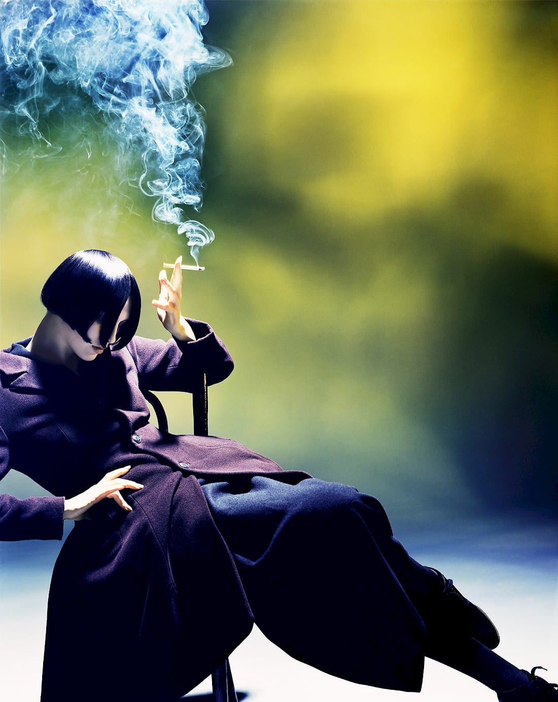
His photography has a lot of elements you might expect from street photography, with complex backgrounds and contrasting colour schemes between the foreground and background. The contrast between the foreground and the background is clearly defined by the harsh blur on the background with the subject being very crisp. Elements like smoke or water can add a lot to a photograph, as the shapes you normally come across are very simple, whereas water and smoke always have a very complex pattern and shape, which I think adds a lot to the dynamics of a photograph.
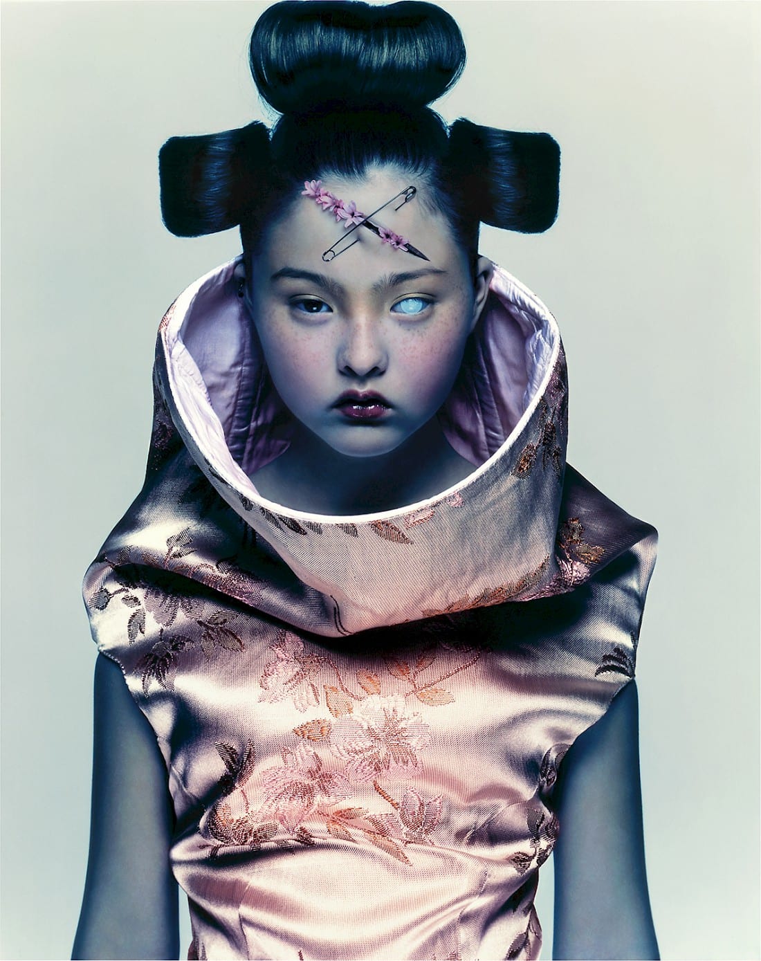 However in some of his photography, the colours are a lot more toned down with subtle contrast between the subject and the background, which can be seen in the above photograph through the desaturated blue on her arms and the slightly blue tinged background. This kind of desaturated look creates a kind of depressive look, which I think adds a lot to the overall tone of the image, in that you’d interpret this image very differently in it’s current states as opposed to if it was more vibrant.
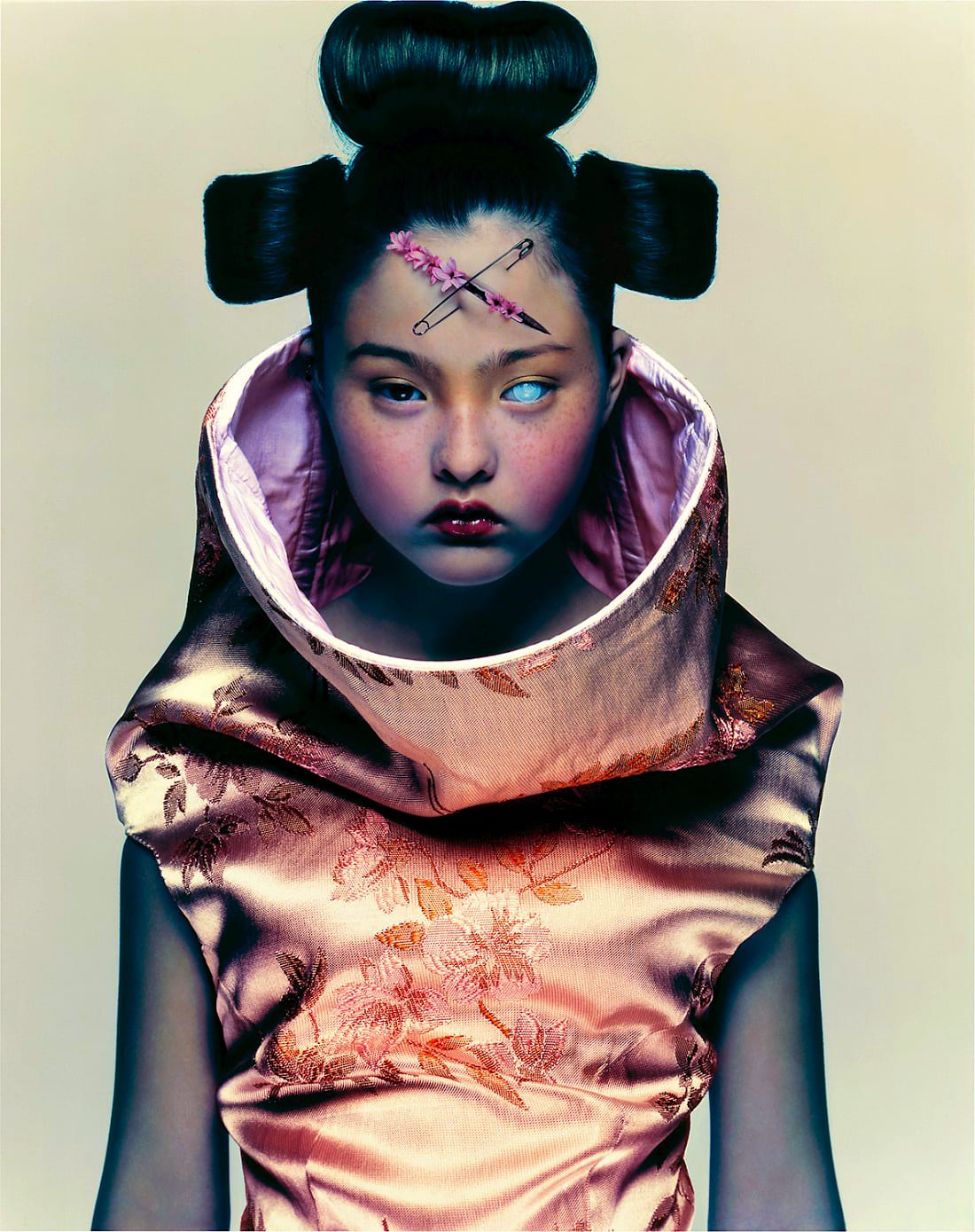 I tried to make the image more vibrant to see what kind of mood this would create, and I think that bringing out the reds and dulling down the blues makes the image look a lot warmer and chances the overall tone of the image, however I think that this takes away from the initial message of the photograph.
Development
For my self portrait I wanted to keep it simple, but experiment with different styles of lighting.
 So I started with a Badger style of lighting, but quickly abandoned it as I felt that it brought attention to the wrong area’s of my face, that being the edges of my face and my neck, whereas I wanted the focus to be a lot more central.
 Next I tired a flat light, hoping that with everything in view, the eye would be drawn naturally to area’s on interest, however with everything evenly lit there’s no contrast between different area’s of my face and it feels too flat.
 The Split/Short style I felt captured what I was going for a lot better, this being the setup that Mark Seliger uses very often to capture his subjects. with the shadows cast giving some contrast to my face, however I didn’t like how symmetrical it looked. So I decided to keep this angle of lighting and instead move myself.
 After trying out quite a few angles I decided that the side portrait looked a lot better as it removed the issue of it looking too symmetrical while keeping the contrast created through the shadows and angle of my face.
 In post I brought out some of the highlights on the left side of my face and then desaturated the whole image slightly to make to colours look flatter.
For my image of an acquaintance I wanted to take it out of the studio and capture someone while they were unaware they were being photographed. I did do some experimentation with studio photography before I decided this however.
 While I was really happy with the results I knew that I wanted to try something different, however I learnt a lot about lighting different face types and how angles can affect the way a portrait looks.

I took this image of my friend while we were heading down to London, I thought it captured him well and I really liked the composition of to the photo.

I cooled the image down and tried to bring out some more of the details in his face to distinguish him more from the background. I thought this turned out well but I wanted to add some more movement to the image. So I took a look back at some of the research I did for appropriation and added some motion blur to the background.
 This is my final image for my acquaintance picture.
I was considering what to do for stranger for quite some time. I thought about taking pictures of people on the street, but I wanted to make it slightly more personal. So when I was round a friends house I asked one of his flatmates if I could take a picture of him sitting in his room.
 Since I didn’t do much in the way of planning it’s not lit very well and little thought had gone into the background. However the lighting can be fixed as the photo was raw, and I really like the expression he’s holding in this image.

The lighting was an easy fix and brought out a lot of the detail in his hair and his face.